Style - The Twilight Saga
Opening Titles
Within this project I will be emulating the style of a movie sequence. Drawing from my Artist research into Ellie Davies, I have selected the The Twilight Saga as my movie of choice as the opening titles in this film also portray an almost surreal take on landscape photography. I will try to recreate the movies style within my own photographs and also incorporating my theme into my images.
Style Research
 Within the movie's opening sequence the director has selected a clearly edited image as the background for the films title page. I think that the photograph has been enhanced in order to create impact and appeal. The striking blood red sky with the atmospheric moon certainly grabs attention and I love the strong use of colour in this image. The selection of red fits perfectly with the movies theme of vampires and blood giving the viewer no doubt as to the genre of the film. The hills are almost silhouettes against this strong sky and I think that this is extremely effective and memorable. I like the overall composition of the shot and the balance between the hills and the sky with the sweeping horizon placed just off centre draws our attention to the title of the film. I will experiment with silhouettes and hope to photograph some of my own sunsets in order to explore this visual technique further.
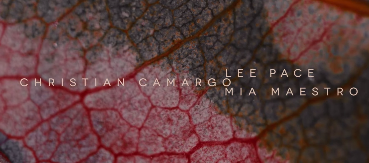
 This is the first area of the opening titles which is directed towards both man and nature fitting completely with my theme. I loved this unusual imagery which at first the viewer believes is blood, however, upon closer inspection is actually images of leaf cells. This particular clip shows the freezing and disappearance of the red areas. The clips try and mainly focus on the difference between living and dead cells.
 The second image from the title sequence shows a more clear demonstration of where the leaf cells and skin cells meet once again. I loved this visual macro image and found the veins very dramatic. The lines within the skin cells provided great interest within the image and the colour again fitted very well with the theme of the movie. Using this image as inspiration, I decided to try and take my own Macro images and keeping with the them of blood and cells, decided to look at anatomy to emulate a similar shot.
My Own Photographs

 My second photograph taken with inspiration from the opening credits is slightly;y different in style. This time, as the moon was visible, I decided to try and capture this within the frame and although, it is not as bold as in the Breaking Dawn titles, I still feel it's inclusion in the image gives added interest to the crystal clear blue sky. Unfortunately, due to a little camera wobble, I was unable to gain a clear crescent, so perhaps in future I could look to using a tripod to enhance my photograph.
Opening Titles
Within this project I will be emulating the style of a movie sequence. Drawing from my Artist research into Ellie Davies, I have selected the The Twilight Saga as my movie of choice as the opening titles in this film also portray an almost surreal take on landscape photography. I will try to recreate the movies style within my own photographs and also incorporating my theme into my images.
Style Research


My Own Photographs

My first image emulates the title page of Breaking Dawn and it's strong use of silhouette and colour. I enjoyed photographing sunsets and was lucky enough to view several beautiful skies from home during December when the weather turned colder. I loved this beautiful multi coloured shy which had ribbons of purple, orange and pink running though it. The dying tree created the perfect centre to my frame and I liked how it was a direct contrast to the living trees adjacent which were still in leaf. I experimented with composition when taking this photo and began with the striking tree to the left of my frame, however, as the shape was so strong, I decided to place this as the focal point of my photograph which I think worked well.


Contact Sheets


No comments:
Post a Comment